
The short answer: open your site in a tool that sets a phone’s viewport, pixel ratio and user agent, then scroll the whole page at a few common sizes. A mobile simulator does that in one click. Below are the four options, from built-in to specialist.
1. Chrome DevTools device mode
Every copy of Chrome has a device mode. Press F12, then Ctrl+Shift+M (Cmd+Shift+M on Mac), pick a phone from the Dimensions menu and reload.
- Good at: fixing one CSS rule at a time, with the inspector right beside the page; network and CPU throttling.
- Misses: anything that only shows when you compare sizes, because you see one device at a time. The device list also lags behind new phones.
Full steps are in our guide to mobile view in Chrome.
2. A mobile simulator extension
A simulator extension shows the page inside real device frames, often several at once. PocketView puts two phones side by side for free, keeps their scrolling in sync and sends each device’s own user agent, so sites that detect phones on the server send their mobile version.
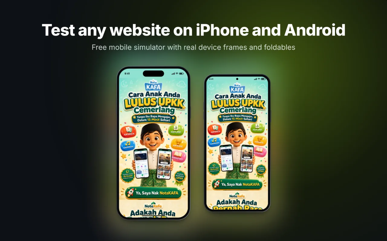
- Good at: comparing sizes, checking the newest phones and foldables, recording a demo or bug report.
- Misses: engine differences. On Chrome, an iPhone frame shows the iPhone layout, not Safari’s rendering.
3. Resize your browser window
Drag the edge of the window until the page switches to its mobile layout. Free and instant, and a fine way to find where a breakpoint kicks in. But a narrow desktop window is not a phone: no touch, no mobile user agent, no high pixel ratio, and scrollbars take space a phone would not have. Use it to find breakpoints, not to sign off a design.
4. Cloud device services
Services that stream real phones from a data centre show the real browser engine, which makes them the closest you get to a phone without owning one. They are usually paid after a trial, slower to use, and need a tunnel to reach localhost. Keep them for the bugs a simulator cannot show.
Which sizes to test
You do not need every phone. These four widths cover most people:
| Width | Why |
|---|---|
| 360 px | Small Android phones, the narrowest common width |
| 390 to 402 px | Most current iPhones |
| 430 to 440 px | Large phones (Pro Max, Plus, big Android phones) |
| 768 to 834 px | Tablets in portrait and open foldables |
Exact numbers for every model are in the viewport sizes table.
A 5-minute test routine
- Small and large phone side by side. Scroll the whole page. Look for sideways scrolling, overlapping text and buttons that are too small to tap.
- Open every menu and form. Mobile menus and long forms break most often.
- Rotate to landscape. Sticky headers and cookie bars can cover half the screen.
- Switch to a tablet. The in-between widths are where grids squeeze.
- Check dark mode if your site supports it.
For a longer list, use the responsive checker checklist.
What still needs a real phone
- Safari-only rendering bugs on iPhone (all iPhone browsers use Safari’s engine)
- The on-screen keyboard pushing content around in forms
- Real speed on a mid-range phone and a slow connection
- Native pickers for dates and selects, and video autoplay rules
Borrow one iPhone and one Android phone for an hour before launch, and do everything else from your laptop.
Questions
Can I test a website on mobile without a phone for free?
Yes. Chrome DevTools device mode is built in and free, and PocketView is a free extension that shows several phones side by side. Both run on any computer.
Is testing in a desktop browser accurate enough?
For layout, breakpoints and content, yes, as long as the tool uses each phone’s real viewport and user agent. Engine-specific bugs (Safari on iPhone) and real performance still need a real device before launch.