
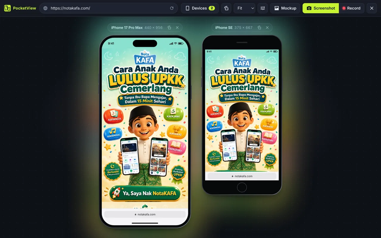
What a mobile simulator does
A mobile simulator shows your website the way a phone would: at the phone’s screen size, with its pixel density, and with the browser telling your site it is a phone. PocketView sets four things for every device:
- CSS viewport. The width and height your media queries see, such as 402 × 874 for iPhone 17 Pro.
- Pixel ratio.
devicePixelRatioof 2, 3 or 3.5, so sharp images andsrcsetchoices match the device. - User agent. Sent in the HTTP header and in JavaScript (including
navigator.userAgentData), so server-side and client-side mobile detection both fire. - Touch. A round touch cursor, drag to scroll with momentum, hidden scrollbars and
maxTouchPointsset, like a finger on glass.
Simulator, emulator or real device?
The words get mixed up, so here is the short version.
| Tool | What it runs | Best for |
|---|---|---|
| Mobile simulator (PocketView) | Your site in Chrome at device sizes, with the device user agent | Daily responsive checks, demos, screenshots |
| Emulator (Android Studio, Xcode Simulator) | A full copy of the phone’s operating system and browser | Engine-specific bugs, native apps |
| Real device | The real thing | Final check before launch, performance on slow phones |
Most layout problems show up in a simulator in seconds. Keep an emulator or a real phone for the last 5% of bugs.
How to use PocketView in 3 steps
- Add PocketView to Chrome. One click from the Chrome Web Store. Pin it to your toolbar.
- Open any page and click the icon (or press Alt+Shift+M). The tab turns into a simulator with two devices.
- Pick your devices. Open Devices, search by name or size (try “fold” or “390”), or choose a quick set such as iPhone + Android.
The device library
36 devices (including the free-size responsive view), updated as new phones launch (see the changelog):
- Foldables: iPhone Duo, Galaxy Z Fold8, Galaxy Z Fold8 Ultra, Xiaomi 18 Fold, Galaxy Z Flip8
- iPhone: iPhone 17 Pro Max, iPhone 17 Pro, iPhone Air, iPhone 17, iPhone 16 Pro Max, iPhone 16 Pro, iPhone 16 / 15, iPhone 15 Pro Max / 16 Plus, iPhone 16e / 14 / 13, iPhone 13 mini, iPhone SE
- Android: Galaxy S25 Ultra, Galaxy S24 / S25, Galaxy S20 Ultra, Galaxy A51 / A71, Galaxy Z Fold5 (folded), Pixel 7 / 8, Android Large, Android Standard, Android Compact
- Tablets: iPad mini, iPad Air 11" / iPad, iPad Pro 11", iPad Pro 12.9", Android Tablet, Surface Pro 7
- Laptops and desktop: Laptop 1280, Laptop 1366, MacBook Air 13", Desktop Full HD
- Responsive: drag to any size, with a breakpoint ruler. Save your own custom devices too.
Every viewport size is listed on the viewport sizes page.
Features for developers
- Dark mode: force
prefers-color-scheme: darkwithout changing your system theme. - App mode: emulate
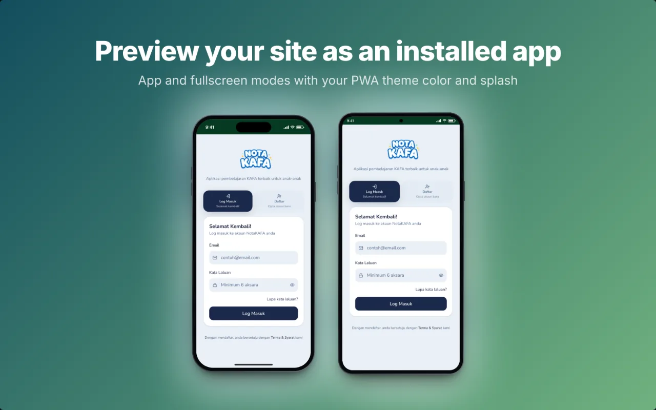
display-mode: standaloneandfullscreento test your PWA, with the splash screen from your manifest. - Sites that block frames: PocketView lifts frame-blocking headers inside the simulator tab only, and if a site tries to break out, it reloads it in a contained mode and tells you.
- Setup links: copy a link with the exact devices, orientation and mode to share with your team.
- Keyboard: R rotates every device, S takes a screenshot.
Questions
Is a mobile simulator accurate?
For layout, yes. PocketView uses each device’s CSS viewport, pixel ratio and user agent, so media queries, breakpoints and mobile detection behave as on the phone. It runs on Chrome’s engine, so engine-specific bugs (Safari on iPhone, for example) still need a real device.
Can I test iOS Safari bugs with it?
Not fully. You will see the iPhone layout, Safari bars and iOS user agent, but rendering quirks unique to WebKit only show in Safari. Use PocketView for daily checks and a real iPhone or Xcode’s Simulator on a Mac for the final pass.
How is it different from Chrome DevTools device mode?
DevTools shows one device at a time inside the inspector. PocketView shows several devices side by side with real frames, syncs scrolling and clicks between them, and adds recording, mockups, app mode and foldables. Many developers use both.
Does it work offline or on localhost?
Yes. Any URL your browser can open works, including localhost, local IP addresses and staging servers.
Comparing tools? Read mobile simulator extensions compared, or see the iPhone simulator and Android simulator pages.