
Google retired the Mobile-Friendly Test. What replaced it?
In December 2023 Google shut down the Mobile-Friendly Test, its API and the Mobile Usability report in Search Console. Mobile usability still matters for search; Google simply recommends other tools now:
- Lighthouse in Chrome DevTools (Lighthouse tab, choose Mobile): checks the viewport tag, font sizes, tap targets and much more, with a score out of 100.
- PageSpeed Insights (pagespeed.web.dev): the same Lighthouse audit run from Google’s servers, plus real-user speed data for popular pages.
- Search Console’s Core Web Vitals report: speed and stability on real phones for your whole site.
Automated tools are good at rules. They cannot tell you that your menu covers the logo at 390 px or that the pricing table is unreadable on a small phone. For that you need to look.
Free 12-point mobile friendly checklist
- Viewport tag present:
<meta name="viewport" content="width=device-width, initial-scale=1">. - No sideways scroll at 360 px.
- Body text at least 16 px.
- Tap targets at least 48 × 48 px, with 8 px between them.
- Navigation reachable with one thumb; the menu button is easy to find.
- Images scale down and stay sharp; no fixed widths wider than the screen.
- Forms use the right input types, and labels stay visible while typing.
- No intrusive pop-ups that cover the content as soon as the page opens.
- Sticky bars (header, cookie notice, chat) leave most of the screen for content.
- Tables and code blocks scroll inside their own box.
- Speed: Largest Contentful Paint under 2.5 s on a mid-range phone.
- Landscape works too.
Test your page on real device sizes
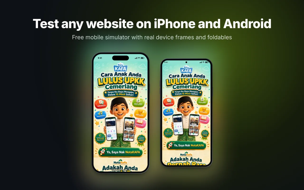
To check points 2 to 10 quickly, open the page in PocketView. It shows a small and a large phone side by side with their real viewport and mobile user agent; switch to a tablet with one click and press R for landscape.
Questions
How do I check if my site is mobile friendly?
Run Lighthouse (built into Chrome DevTools) or PageSpeed Insights for the automated checks, then look at the page yourself on a few real phone sizes using the 12-point checklist on this page. The automated tools catch tiny text and missing viewport tags; your eyes catch overlapping menus and awkward layouts.
Does mobile friendliness affect SEO?
Yes. Google indexes the mobile version of your pages first, and mobile usability is part of its page experience guidance. A page that is hard to use on a phone also loses visitors, which matters more than any single ranking signal.
Is the Google Mobile-Friendly Test still available?
No. Google retired the Mobile-Friendly Test tool, its API and the Search Console Mobile Usability report in December 2023 and points people to Lighthouse instead.
More: the responsive checker guide and the viewport sizes table.