Way 1: Chrome DevTools device mode
Built into Chrome, free, and good for quick checks of one device.
- Open DevTools. Press F12, or Ctrl+Shift+I on Windows and Cmd+Option+I on Mac.
- Turn on the device toolbar. Press Ctrl+Shift+M (Cmd+Shift+M on Mac), or click the phone and tablet icon at the top left of DevTools.
- Choose a device. Pick one from the Dimensions menu at the top of the page, or type a width and height.
- Reload the page. Some sites only send their mobile version after a reload with the mobile user agent.
Good: no install, network throttling, CSS inspection right next to the page. Limits: one device at a time, no device frame, the DevTools panel takes half your screen, and the device list is short on new phones and foldables.
Way 2: a mobile view extension
A mobile view extension opens the page at phone size with one click, without opening DevTools. Most show a single phone and change the window or frame size. Check that the one you choose also sets the mobile user agent; otherwise sites that detect phones on the server will still send the desktop version.
Way 3: side by side devices with PocketView
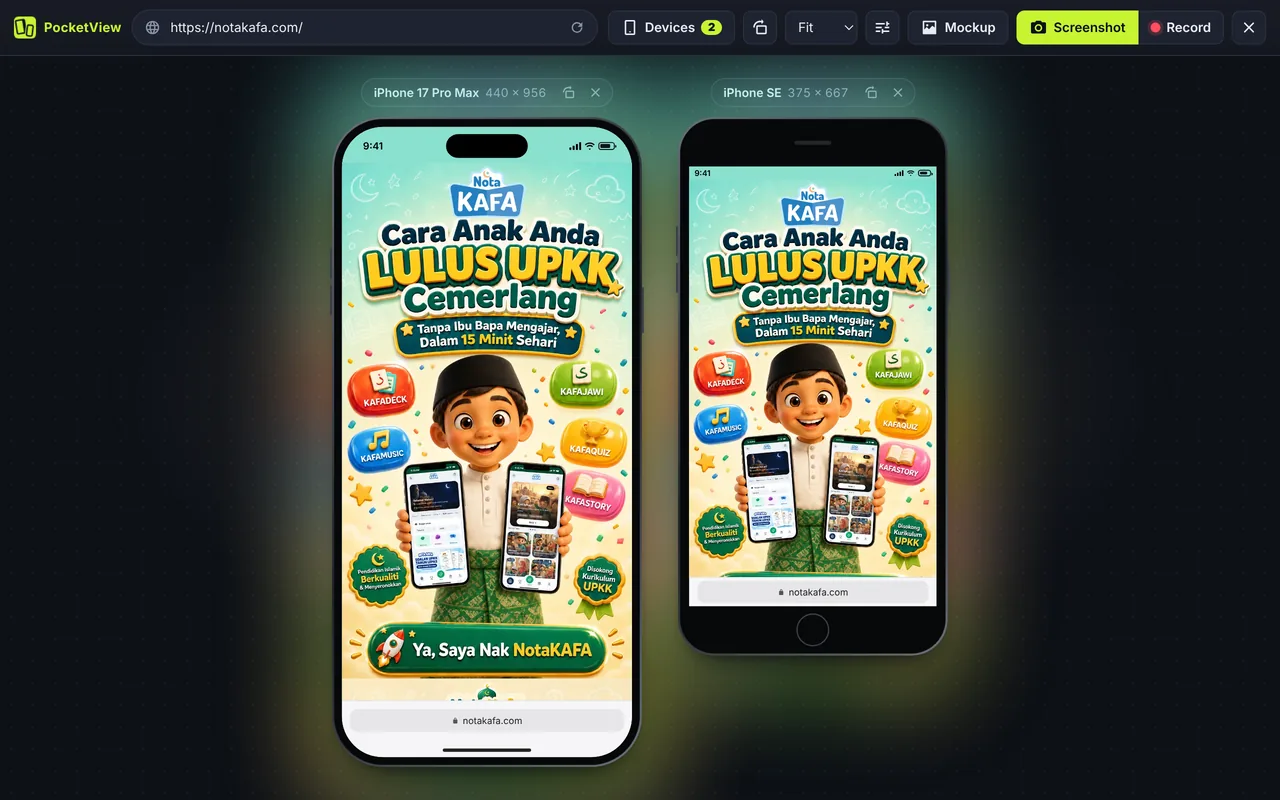
PocketView is a mobile view extension that shows several devices at once, each with a real frame, its own user agent and touch scrolling.
- Add PocketView to Chrome and pin it to the toolbar.
- Click the icon on any page or press Alt+Shift+M. The page opens on two phones.
- Change devices from the Devices menu: iPhone, Galaxy, Pixel, foldables, iPad or laptops.
- Scroll one device and the other follows. Press R to rotate, S for a screenshot.
Which way to use when
| You want to | Use |
|---|---|
| Inspect and fix one CSS rule at a phone width | DevTools device mode |
| Test network speed or CPU throttling | DevTools device mode |
| See your site on phone, tablet and laptop together | PocketView |
| Check new phones and foldables | PocketView |
| Record a demo or make a mockup for a client | PocketView |
| Find a bug that only happens in Safari | A real iPhone |
Mobile view on Chrome for Android
On a phone, Chrome shows the mobile version by default. To check the desktop version from your phone, tap the three-dot menu and tick Desktop site. Tap it again to return to mobile view. On iPhone, Chrome has the same option under the menu as Request Desktop Site.
Questions
How do I switch Chrome back to desktop view?
In DevTools, click the device toolbar icon again or press Ctrl+Shift+M (Cmd+Shift+M on Mac). In PocketView, click the extension icon again or the close button in its top bar and the tab goes back to the normal page.
Why does my site look different on my real phone?
Usually one of four things: the phone’s browser engine (Safari on iPhone renders some CSS differently), a different font being available, the on-screen keyboard or browser bars taking space, or the phone using a display zoom setting that changes the viewport. Check the viewport meta tag first: without <meta name="viewport" content="width=device-width, initial-scale=1">, phones show a zoomed-out desktop page.
Can I see mobile view on Chrome for Android or iPhone?
Chrome on a phone already shows the mobile version. To see the desktop version there, open the menu and tick Desktop site. Untick it to go back.
Related: how to check a site on every screen size and the phone viewport sizes table.