Test your site on iPhone without a Mac
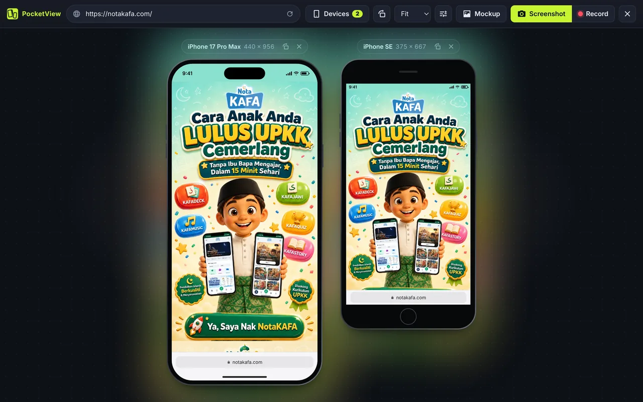
Apple’s own simulator only runs on a Mac, inside Xcode. If you build on Windows or Linux, or just want a faster check, PocketView shows your website inside accurate iPhone frames in Chrome. Each iPhone uses its real CSS viewport, pixel ratio and iOS user agent, so your responsive CSS and any iPhone detection behave as they would on the phone.
iPhone models included
Sizes are CSS pixels in portrait, the numbers your media queries see.
| Device | CSS viewport | Pixel ratio | Screen pixels |
|---|---|---|---|
| iPhone 17 Pro Max | 440 × 956 | 3 | 1320 × 2868 |
| iPhone 17 Pro | 402 × 874 | 3 | 1206 × 2622 |
| iPhone Air | 420 × 912 | 3 | 1260 × 2736 |
| iPhone 17 | 402 × 874 | 3 | 1206 × 2622 |
| iPhone 16 Pro Max | 440 × 956 | 3 | 1320 × 2868 |
| iPhone 16 Pro | 402 × 874 | 3 | 1206 × 2622 |
| iPhone 16 / 15 | 393 × 852 | 3 | 1179 × 2556 |
| iPhone 15 Pro Max / 16 Plus | 430 × 932 | 3 | 1290 × 2796 |
| iPhone 16e / 14 / 13 | 390 × 844 | 3 | 1170 × 2532 |
| iPhone 13 mini | 375 × 812 | 3 | 1125 × 2436 |
| iPhone SE | 375 × 667 | 2 | 750 × 1334 |
Plus iPhone Duo on the foldable simulator page, and iPads on the viewport sizes page.
Safari bars, Dynamic Island and the iOS user agent
- Real frames: Dynamic Island on iPhone 14 Pro and later, the notch on older models, the Home button on iPhone SE.
- Status bar and Safari bar: turn browser bars on to see how much space Safari’s address bar takes from your first screen.
- iOS user agent: sent in the HTTP header and JavaScript, so server-side redirects and scripts that look for “iPhone” both work.
- Frame colours: pick a finish for screenshots and mockups that match the phone your client owns.
What an iPhone simulator in Chrome cannot do
Every browser on iPhone uses Apple’s WebKit engine. PocketView runs on Chrome’s Blink engine, so it shows the iPhone layout, not WebKit’s rendering. Things to double-check on a real iPhone or in Xcode’s Simulator:
100vhand the moving Safari toolbar (use100dvhor100svh)- Date and select inputs, which use native iOS pickers
- Autoplay rules for video and audio
- Very new CSS features that WebKit has not shipped yet
For everything else (layout, breakpoints, images, fonts, navigation) the simulator is the fastest way to check.
Questions
Can I run Safari on Windows?
No. Apple stopped making Safari for Windows in 2012. On Windows you can preview iPhone layouts in Chrome with an iPhone simulator like PocketView, but to test Safari’s own engine you need a Mac (Xcode’s Simulator), a real iPhone, or a cloud device service.
Is there a free iOS simulator online?
Cloud services stream real iPhones, usually with a free trial and then a monthly price. For everyday layout checks, PocketView is free and runs in your own browser, so it also works on localhost.
Which iPhone sizes matter most?
Most current iPhones are 390 to 402 px wide; the Pro Max and Plus models are 430 to 440 px. If your layout works at 375, 390, 402 and 440 px, it will work on almost every iPhone in use.
Does PocketView show the Dynamic Island and Safari bars?
Yes. iPhone frames show the Dynamic Island, the notch or the Home button depending on the model, an iOS status bar, and Safari’s address bar when browser bars are on.
Testing Android too? See the Android simulator, or put an iPhone and a Galaxy side by side in the responsive viewer.