Check any website in 30 seconds
- Open the page you want to check in Chrome: live, staging or localhost.
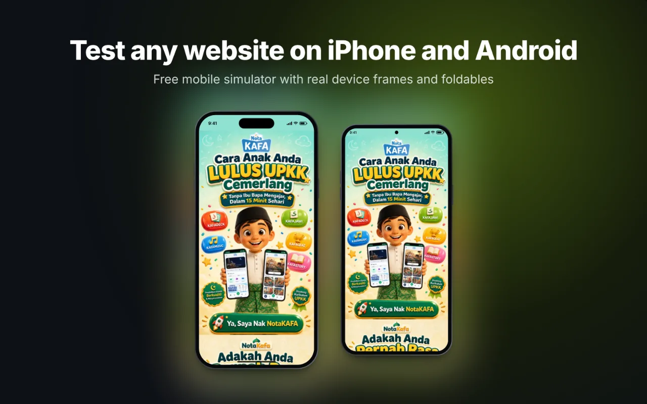
- Click the PocketView icon. The page opens on an iPhone and an Android phone side by side.
- Scroll from top to bottom. Sync scroll moves both devices together. Look for anything that overflows, overlaps or shrinks too small.
- Swap in a tablet and a laptop. Use the Phone + Tablet or Mobile + Desktop quick set, then press R to check landscape.
What to look for: a 10-point responsive checklist
- No sideways scroll. Nothing should be wider than the screen. Swipe left on each device; the page should not move.
- Readable text. Body text at least 16 px on phones, line length under about 75 characters on large screens.
- Tap targets. Buttons and links at least 44 to 48 px tall, with space between them.
- Navigation. The menu opens, closes and fits on a 360 px screen.
- Images. Not stretched, not cropped badly, and sharp on 3x screens.
- Forms. Inputs fill the width, labels stay visible and the right keyboard type is set (
type="email",inputmode="numeric"). - Tables. Wide tables scroll inside their own box instead of pushing the page wider.
- Sticky elements. Headers, cookie bars and chat buttons do not cover the content on short screens.
- Landscape. Nothing breaks when the phone is turned sideways.
- Dark mode. If your site supports it, check it with PocketView’s dark mode switch.
Testing localhost and staging sites
Online checkers run on someone else’s server, so they cannot see localhost or a staging site behind a login. PocketView runs in your own browser, so it can. Start your dev server, open http://localhost:3000 (or your port) and click the icon. Hot reload keeps working inside the devices.
Tip: Copy setup link saves your devices and settings in a URL. Pin it next to your dev server and every check starts with the same screens.
When to check on a real device
A simulator gets layout right because it uses each phone’s real viewport, pixel ratio and user agent. It cannot reproduce a phone’s browser engine, its speed or its on-screen keyboard. Before a big launch, open the site on one real iPhone and one real Android phone, focusing on forms, video, and anything with fixed positioning.
Questions
Is there a responsive checker that works without installing anything?
Chrome DevTools has a device mode built in (press F12, then Ctrl+Shift+M). It shows one device at a time. Online checkers load your site inside frames on their own website, which fails for many sites and cannot reach localhost. An extension like PocketView runs in your own browser, so it works with any URL.
Why does a site load blank in a responsive checker?
Many sites send headers that forbid being shown inside a frame, and checkers that use frames show a blank box. PocketView lifts those headers inside its own tab only, and reloads sites that try to break out of the frame in a contained mode, so far fewer sites come up blank.
How many sizes should I check?
At least four: a small phone (360 px), an average iPhone (390 to 402 px), a tablet in portrait (768 to 834 px) and a laptop (1280 px or more). Add a foldable if your audience uses them.
Next: the mobile friendly test checklist, or see all widths at once in the responsive viewer.