See phone, tablet and desktop together
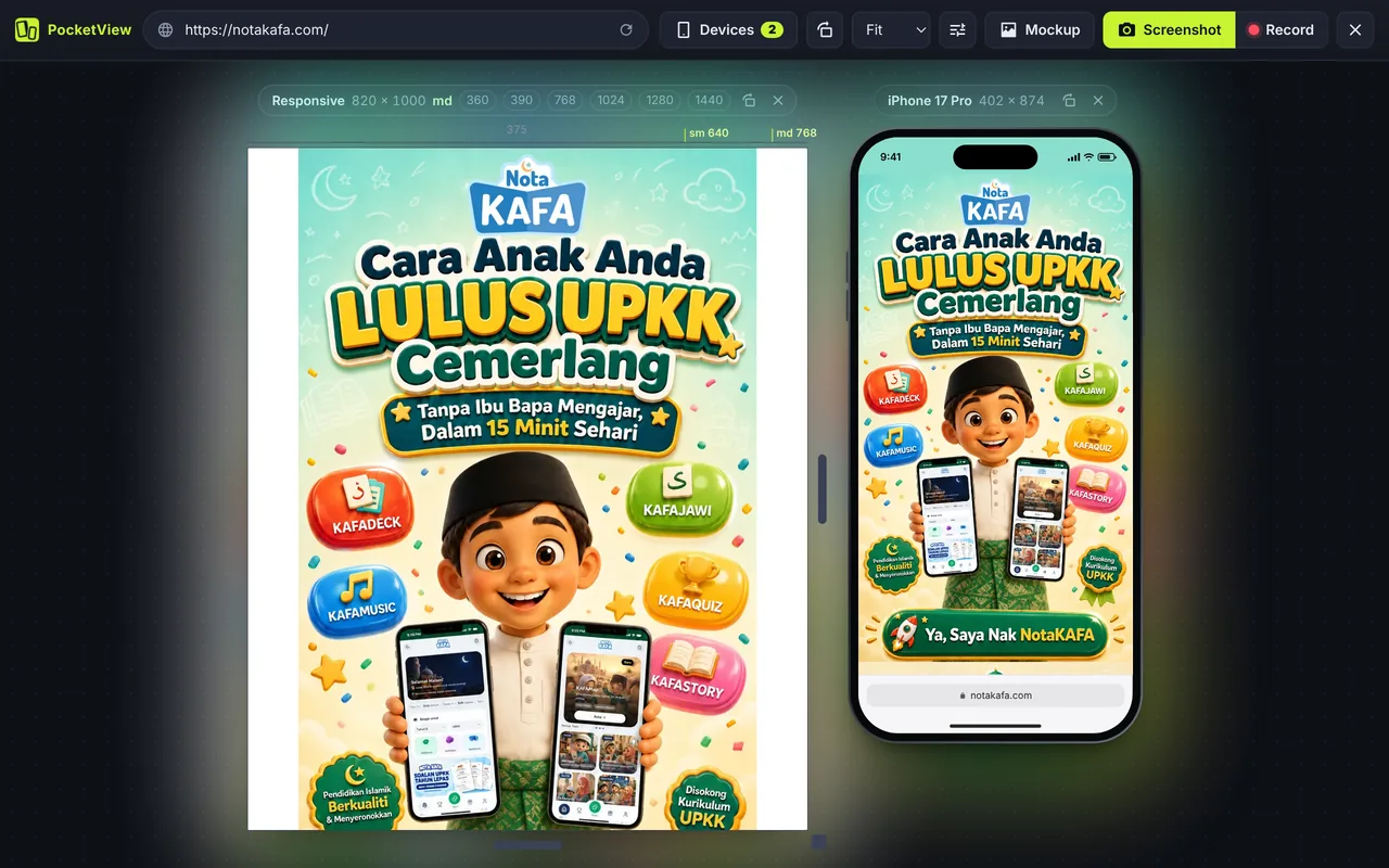
Responsive bugs hide in the gaps between screen sizes: a menu that wraps at 820 px, a card grid that squeezes at 390 px, a hero image that crops badly on a tablet. Looking at one size at a time means you miss them. With PocketView you pick two devices from 36 (any mix of phones, foldables, tablets and laptops) and see the same page on both at once.
Quick sets save clicks: iPhone + Android, Phone + Tablet, Small vs Large, Mobile + Desktop and Foldables.
Drag to any width with the breakpoint ruler
The Responsive device has drag handles on its sides and bottom. As you drag, a ruler along the top marks the common breakpoints, so you can see exactly where your layout switches:
| Name | Min width | Typical device |
|---|---|---|
sm | 640 px | Large phones in landscape |
md | 768 px | Small tablets in portrait |
lg | 1024 px | Tablets in landscape, small laptops |
xl | 1280 px | Laptops |
2xl | 1536 px | Large desktop screens |
Width chips (360, 390, 768, 1024, 1280, 1440) jump straight to the sizes people use most.
Sync scroll and clicks
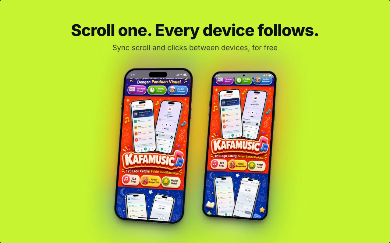
Scroll one view and the others follow to the same point on the page. Click a link and every device navigates. That makes it easy to compare one section, such as a pricing table, across all your screens without hunting for it in each one.
Common breakpoints and why they matter
Breakpoints are not about devices; they are about where your content breaks. Still, real device widths cluster in a few places worth checking every time:
- 360 px: many Android phones, the smallest width most sites need to support.
- 390 to 402 px: most current iPhones.
- 412 to 440 px: large Android phones and Pro Max iPhones.
- 744 to 834 px: iPads in portrait and open book-style foldables.
- 1280 to 1440 px: most laptops.
Need the exact numbers? See the full phone and tablet viewport sizes table.
Questions
What breakpoints should I test?
Test the widths your CSS framework switches at, plus the most common real devices. With Tailwind that is 640, 768, 1024, 1280 and 1536 px. Add 360 and 390 px for small and average phones, and 820 px for an iPad in portrait.
Can I save a set of devices?
Yes. PocketView remembers your last devices, and Copy setup link saves the devices, orientation and mode in a link you can bookmark or send to a teammate.
Does it work with Tailwind, Bootstrap and other frameworks?
Yes. PocketView does not touch your CSS. It sets a real viewport width, so every media query and container query fires as it would on the device.
How many screens can I view at once?
Two side by side in the free version, from any mix of phones, tablets, foldables and laptops. Pro, coming later, will allow more at once.
Want a quick pass on one site? Try the responsive checker guide, or compare responsive viewer extensions.