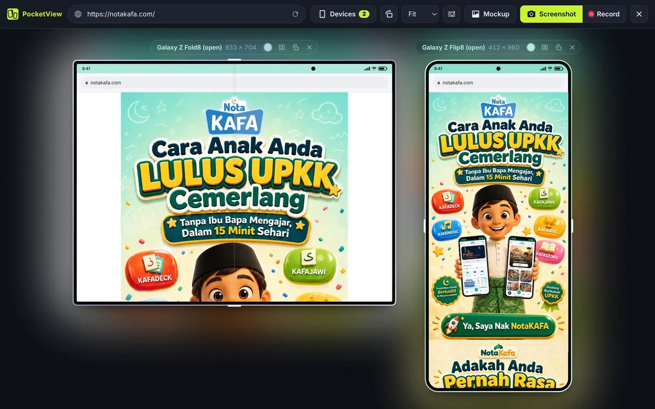
Galaxy Z Fold8, Z Fold8 Ultra, Z Flip8, Xiaomi 18 Fold and iPhone Duo
Each foldable has two screens that your website has to work on: a cover screen when it is closed and a larger inner screen when it is open. Here are the sizes PocketView uses.
| Device | Folded (cover) | Unfolded (inner) | Pixel ratio |
|---|---|---|---|
| iPhone Duo * | 466 × 678 | 951 × 669 | 3 |
| Galaxy Z Fold8 * | 475 × 751 | 933 × 704 | 2.625 |
| Galaxy Z Fold8 Ultra * | 412 × 960 | 954 × 860 | 2.625 |
| Xiaomi 18 Fold * | 425 × 623 | 860 × 608 | 2.75 |
| Galaxy Z Flip8 * | 361 × 399 | 412 × 960 | 2.625 |
Fold and unfold: what changes for your layout
- Book-style foldables (Galaxy Z Fold8, Xiaomi 18 Fold) open to a wide, almost square screen of 860 to 954 px. Your tablet breakpoint (
md, 768 px) kicks in, so check that a two-column layout really fits. - Passport-style iPhone Duo is wide even when closed, with a control column beside the screen. Its cover screen sits between a phone and a small tablet.
- Flip phones (Galaxy Z Flip8) open to a normal tall phone, but the small cover screen can also run websites. Check that your header and cookie banner do not fill it.
- Unfolding resizes the page while it is open. Make sure your site handles a
resizewithout losing form input or scroll position.
CSS for foldables
Most foldable support comes from ordinary responsive CSS. A few extra tools help:
- Aspect ratio queries:
@media (min-aspect-ratio: 4/5)catches open book-style foldables that are wider than a phone but not as wide as a tablet in landscape. - Container queries: let a card or sidebar adapt to its own width, which works on every screen shape.
- Viewport segments: browsers are adding
@media (horizontal-viewport-segments: 2)and theenv(viewport-segment-*)variables for content that should avoid the fold. Check support before relying on them, and treat them as an extra, not a requirement.
Questions
What is the viewport of the Galaxy Z Fold8?
In PocketView, the Galaxy Z Fold8 uses 475 × 751 CSS px on the cover screen and 933 × 704 CSS px unfolded, at a pixel ratio of 2.625. These are estimates from the panel resolution; check the exact value on a real device once you have one.
Do I need special CSS for foldables?
Usually not. A well-built responsive layout already handles the cover screen like a narrow phone and the inner screen like a small tablet. Check that nothing assumes “phones are always tall”: open book-style foldables are almost square or wider than tall, so orientation: landscape can be true on a device held upright.
How do I fold and unfold a device in PocketView?
Each foldable has a Fold switch in its label bar above the frame. Click it to open or close the device and the screen changes to the new size, just as it does when you open a real foldable.
See every device size on the viewport sizes page, or compare foldables with regular phones in the responsive viewer.